1. Objective
Apply descriptive statistics to explore data collections and compute quantitative descriptions. Recall that descriptive statistics applies the concepts, measures, and terms that are used to describe the basic features of the samples in a study. Together with simple graphics, these measures form the basis of quantitative analysis of data. To describe the sample data and to be able to infer any conclusion, we should go through several steps: data preparation and descriptive analytics.
2. Material
- Jupyter Notebook Server
- Python libraries
- Data collection: https://archive.ics.uci.edu/ml/datasets/Adult.
3. To Do and To Hand In
- Go through the exercise and execute the functions that help you explore the content of the data collection.
- In markdown cells in your notebook report the questions and answers obtained. Write at the end the research questions that the exploration answered to, and your interpretation for answering them according to the statistical results.
- Download your notebook store it in your personal public space and share the URL here in the column HO-2
4. Playing with the Education and training data
Let us consider a public database called the “Adult” dataset, hosted on the UCI’s Machine Learning Repository. It contains approximately 32,000 observations concerning different financial parameters related to the US population: age, sex, marital (marital status of the individual), country, income (Boolean variable: whether the person makes more than $50,000 per annum), education (the highest level of education achieved by the individual), occupation, capital gain, etc.
We will show that we can explore the data by asking questions like: “Are men more likely to become high-income professionals than women, i.e., to receive an income of over $50,000 per annum?”
4.1 Getting acquainted with data
First, let us read the data:
file = open('files/adult.data', 'r')
Checking the data, we obtain:
def chr_int(a):
    if a.isdigit():
        return int(a)
    else:
        return 0

data=[]
for line in file:
     data1=line.split(', ')
     if len(data1)==15:
        data.append([chr_int(data1[0]),data1[1],chr_int(data1[2]),data1[3],chr_int(data1[4]),data1[5],data1[6],\
            data1[7],data1[8],data1[9],chr_int(data1[10]),chr_int(data1[11]),chr_int(data1[12]),data1[13],\
            data1[14]])
print (data[1:2])
- What is the obtained result? What did you ask for in the previous command? Explain.
One of the easiest ways to manage data in Python is by using the DataFramestructure, defined in the Pandas library, which is a two-dimensional, size-mutable, potentially heterogeneous tabular data structure with labeled axes:
%matplotlib inline
import pandas as pd

df = pd.DataFrame(data) #  Two-dimensional size-mutable, potentially heterogeneous tabular data structure with labeled axes

df.columns = ['age', 'type_employer', 'fnlwgt', 'education',
                "education_num","marital", "occupation", "relationship", "race","sex",
                "capital_gain", "capital_loss", "hr_per_week","country","income"]
df.head()
- Describe an explain the result.
df.tail()
- Describe and explain the result. Compare with the previous one.
The command shape gives exactly the number of data samples (in rows, in this case) and features (in columns):
df.shape
- Describe an explain the result.
counts = df.groupby('country').size()

print (counts)
5. How many items are there for USA? and for Mexico?
counts = df.groupby('age').size() # grouping by age
print (counts)
6. What is the age of the most represented people?
The first row shows the number of samples with unknown country, followed by the number of samples corresponding to the first countries in the dataset.
Let us split people according to their gender into two groups: men and women.
ml = df[(df.sex == 'Male')] # grouping by sex
ml.shape
ml1 = df[(df.sex == 'Male')&(df.income=='>50K\n')]
ml1.shape
If we focus on high-income professionals separated by sex, we can do:
fm =df[(df.sex == 'Female')]
fm.shape
fm1 =df[(df.sex == 'Female')&(df.income=='>50K\n')]
fm1.shape
df1=df[(df.income=='>50K\n')]

print ('The rate of people with high income is: ', int(len(df1)/float(len(df))*100), '%.' )
print ('The rate of men with high income is: ', int(len(ml1)/float(len(ml))*100), '%.' )
print ('The rate of women with high income is: ', int(len(fm1)/float(len(fm))*100), '%.' )
4.2 Explanatory Data Analysis
The data that come from performing a particular measurement on all the subjects in a sample represent our observations for a single characteristic like country, age, education, etc.
Objective: to visualize and summarize the sample distribution, thereby allowing us to make tentative assumptions about the population distribution.
4.2.1 Summarizing the Data
The data in can be categoricalfor which a simple tabulation of the frequency of each category is the best non-graphical exploration for data analysis. For example, we can ask what is the proportion of high- income professionals in our database:
df1=df[(df.income=='>50K\n')]

print ('The rate of people with high income is: ', int(len(df1)/float(len(df))*100), '%.' )
print ('The rate of men with high income is: ', int(len(ml1)/float(len(ml))*100), '%.' )
print ('The rate of women with high income is: ', int(len(fm1)/float(len(fm))*100), '%.' )
7. Describe an explain the result.
Quantitative: exploratory data analysis is a way to make preliminary assessments about the population distribution of the variable. The characteristics of the population distribution of a quantitative variable are its mean, deviation, histograms,outliers, etc.
4.2.1.1 Mean
In our case, we can consider what the average age of men and women samples in our dataset would be in terms of their mean:
print ('The average age of men is: ', ml['age'].mean(), '.' )
print ('The average age of women is: ', fm['age'].mean(), '.')
print ('The average age of high-income men is: ', ml1['age'].mean(), '.' )
print ('The average age of high-income women is: ', fm1['age'].mean(), '.')
8. Describe an explain the result.
Comment:Later, we will work with both concepts: the population mean and the sample mean. We should not confuse them! The first is the mean of samples taken from the population; the second, the mean of the whole population.
4.2.1.2 Sample Variance
Usually, mean is not a sufficient descriptor of the data, we can do a little better with two numbers: mean and variance:
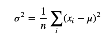
Variance σ2 describes the spread of data. The term (xi−μ) is called the deviation from the mean, so variance is the mean squared deviation.
The square root of variance, σ, is called the standard deviation. We define standard deviation because variance is hard to interpret (in the case the units are grams, the variance is in grams squared). Let us compute the mean and the variance of hours per week men and women in our dataset work:
ml_mu = ml['age'].mean()
fm_mu = fm['age'].mean()
ml_var = ml['age'].var()
fm_var = fm['age'].var()
ml_std = ml['age'].std()
fm_std = fm['age'].std()

print ('Statistics of age for men: mu:', ml_mu, 'var:', ml_var, 'std:', ml_std)
print ('Statistics of age for women: mu:', fm_mu, 'var:', fm_var, 'std:', fm_std)
ml_mu_hr = ml['hr_per_week'].mean()
fm_mu_hr = fm['hr_per_week'].mean()
ml_var_hr = ml['hr_per_week'].var()
fm_var_hr = fm['hr_per_week'].var()
ml_std_hr = ml['hr_per_week'].std()
fm_std_hr = fm['hr_per_week'].std()

print ('Statistics of hours per week for men: mu:', ml_mu_hr, 'var:', ml_var_hr, 'std:', ml_std_hr)
print ('Statistics of hours per week for women: mu:', fm_mu_hr, 'var:', fm_var_hr, 'std:', fm_std_hr)
9. Describe an explain the result.
4.2.1.3 Sample Median
What will happen if in the sample set there is an error with a value very different from the rest? For example, considering hours worked per week, it would normally be in a range between 20 and 80; but what would happen if by mistake there was a value of 1000? An item of data that is significantly different from the rest of the data is called an outlier. In this case, the mean, μ, will be drastically changed towards the outlier. One solution to this drawback is offered by the statistical median, μ12, which is an order statistic giving the middle value of a sample. In this case, all the values are ordered by their magnitude and the median is defined as the value that is in the middle of the ordered list. Hence, it is a value that is much more robust in the face of outliers.
Let us see, the median age of working men and women in our dataset and the median age of high-income men and women:
ml_median= ml['age'].median()
fm_median= fm['age'].median()

print ("Median age per men and women: ", ml_median, fm_median)
ml_median_age= ml1['age'].median()
fm_median_age= fm1['age'].median()

print ("Median age per men and women with high-income: ", ml_median_age, fm_median_age)
ml_median_hr= ml['hr_per_week'].median()
fm_median_hr= fm['hr_per_week'].median()
print ("Median hours per week per men and women: ", ml_median_hr, fm_median_hr)
10. Describe an explain the result.
4.2.1.4 Quantiles and Percentiles
Order the sample {xi}, then find xp so that it divides the data into two parts where:
- a fraction p of the data values are less than or equal to xp and
- the remaining fraction (1−p) are greater than xp.
That value xp is the pth-quantile, or 100×pth percentile.
5-number summary: xmin,Q1,Q2,Q3,xmax, where Q1 is the 25×pth percentile, Q2 is the 50×pth percentile and Q3 is the 75×pth percentile.
4.2.1.5 Data distributions
We can have a look at the data distribution, which describes how often each value appears (i.e., what is its frequency).
The most common representation of a distribution is a histogram, which is a graph that shows the frequency of each value. Let us show the age of working men and women separately.
import matplotlib.pyplot as plt
ml_age=ml['age']
ml_age.hist(histtype='stepfilled', bins=20)
10. Show the graphics and an explain the result.
fm_age=fm['age']
fm_age.hist(histtype='stepfilled', bins=10)
plt.xlabel('Age',fontsize=15)
plt.ylabel('Female samples',fontsize=15)
plt.show()
11. Show the graphics and an explain the result.
We can normalize the frequencies of the histogram by dividing/normalizing by n, the number of samples. The normalized histogram is called the Probability Mass Function (PMF).
import seaborn as sns
fm_age.hist(histtype='stepfilled', alpha=.5, bins=20)   # default number of bins = 10
ml_age.hist(histtype='stepfilled', alpha=.5, color=sns.desaturate("indianred", .75), bins=10)
plt.xlabel('Age',fontsize=15)
plt.ylabel('Samples',fontsize=15)
plt.show()
12. Show the graphics and an explain the result.
The Cumulative Distribution Function (CDF), or just distribution function, describes the probability that a real-valued random variable X with a given proba- bility distribution will be found to have a value less than or equal to x. Let us show the CDF of age distribution for both men and women.
fm_age.hist(histtype='stepfilled', alpha=.5, bins=20)   # default number of bins = 10
ml_age.hist(histtype='stepfilled', alpha=.5, color=sns.desaturate("indianred", .75), bins=10)
plt.xlabel('Age',fontsize=15)
plt.ylabel('PMF',fontsize=15)
plt.show()
13. Show the graphics and an explain the result.
4.2.2 Data distributions
Summarizing can be dangerous: very different data can be described by the same statistics. It must be validated by inspecting the data.
We can look at the data distribution, which describes how often (frequency) each value appears.
We can normalize the frequencies of the histogram by dividing/normalizing by n, the number of samples. The normalized histogram is called Probability Mass Function (PMF).
Let’s visualize and compare the MPF of male and female age in our example:
ml_age.hist(histtype='stepfilled', bins=20)

plt.xlabel('Age',fontsize=15)
plt.ylabel('Probability',fontsize=15)
plt.show()
14. Show the graphics and an explain the result.
fm_age.hist(histtype='stepfilled', bins=20)

plt.xlabel('Age',fontsize=15)
plt.ylabel('Probability',fontsize=15)
plt.show()
15. Show the graphics and an explain the result.
The cumulative distribution function (CDF), or just distribution function, describes the probability that a real-valued random variable X with a given probability distribution will be found to have a value less than or equal to x. For our example, the CDFs will be:
ml_age.hist(histtype='step', cumulative=True, linewidth=3.5, bins=20)

plt.xlabel('Age',fontsize=15)
plt.ylabel('CDF',fontsize=15)
plt.show()
16. Show the graphics and an explain the result.
fm_age.hist(histtype='step', cumulative=True, linewidth=3.5, bins=20)

plt.xlabel('Age',fontsize=15)
plt.ylabel('CDF',fontsize=15)
plt.show()
17. Show the graphics and an explain the result.
ml_age.hist(bins=10, histtype='stepfilled', alpha=.5)   # default number of bins = 10
fm_age.hist(bins=10, histtype='stepfilled', alpha=.5, color=sns.desaturate("indianred", .75))
plt.xlabel('Age',fontsize=15)
plt.ylabel('Probability',fontsize=15)
plt.show()
18. Show the graphics and an explain the result.
ml_age.hist(histtype='step', cumulative=True,  linewidth=3.5, bins=20)
fm_age.hist(histtype='step', cumulative=True,  linewidth=3.5, bins=20, color=sns.desaturate("indianred", .75))
plt.xlabel('Age',fontsize=15)
plt.ylabel('CDF',fontsize=15)
plt.show()
19. Show the graphics and an explain the result.
print ("The mean sample difference is ", ml_age.mean() - fm_age.mean())
20. Explain the result.
4.2.3 Outliers
Ouliers are data samples with a value that is far from the central tendency.
We can find outliers by:
- Computing samples that are far from the median.
- Computing samples whose value exceeds the mean by 2 or 3 standard deviations.
This expression will return a series of boolean values that you can then index the series by:
df['age'].median()
4.2.3.1 Outliner Treatment
For example, in our case, we are interested in the age statistics of men versus women with high incomes and we can see that in our dataset, the minimum age is 17 years and the maximum is 90 years. We can consider that some of these samples are due to errors or are not representable. Applying the domain knowledge, we focus on the median age (37, in our case) up to 72 and down to 22 years old, and we consider the rest as outliers.
Let’s see how many outliers we can detect in our example:
len(df[(df.income == '>50K\n') & (df['age'] < df['age'].median() - 15)])
len(df[(df.income == '>50K\n') & (df['age'] > df['age'].median() + 35)])
If we think that outliers correspond to errors, an option is to trim the data by discarting the highest and lowest values.
df2 = df.drop(df.index[(df.income=='>50K\n') & (df['age']>df['age'].median() +35) & (df['age'] > df['age'].median()-15)])

df2.shape
ml1_age=ml1['age']
fm1_age=fm1['age']
ml2_age = ml1_age.drop(ml1_age.index[(ml1_age >df['age'].median()+35) & (ml1_age>df['age'].median() - 15)])

fm2_age = fm1_age.drop(fm1_age.index[(fm1_age > df['age'].median()+35) & (fm1_age > df['age'].median()- 15)])
mu2ml = ml2_age.mean()
std2ml = ml2_age.std()
md2ml = ml2_age.median()

# Computing the mean, std, median, min and max for the high-income male population

print ("Men statistics: Mean:", mu2ml, "Std:", std2ml, "Median:", md2ml, "Min:", ml2_age.min(), "Max:",ml2_age.max())
mu3ml = fm2_age.mean()
std3ml = fm2_age.std()
md3ml = fm2_age.median()

# Computing the mean, std, median, min and max for the high-income female population
print ("Women statistics: Mean:", mu2ml, "Std:", std2ml, "Median:", md2ml, "Min:", fm2_age.min(), "Max:",fm2_age.max())
print ('The mean difference with outliers is: %4.2f.'% (ml_age.mean() - fm_age.mean()))
print ("The mean difference without outliers is: %4.2f."% (ml2_age.mean() - fm2_age.mean()))
Let us compare visually the age distributions before and after removing the outliers:
plt.figure(figsize=(13.4,5))

df.age[(df.income == '>50K\n')].plot(alpha=.25, color='blue')
df2.age[(df2.income == '>50K\n')].plot(alpha=.45,color='red')

plt.ylabel('Age')
plt.xlabel('Samples')
Let us see what is happening near the mode:
import numpy as np

countx,divisionx = np.histogram(ml2_age)
county,divisiony = np.histogram(fm2_age)
import matplotlib.pyplot as plt

val = [(divisionx[i]+divisionx[i+1])/2 for i in range(len(divisionx)-1)]

plt.plot(val, countx-county,'o-')
plt.title('Differences in promoting men vs. women')
plt.xlabel('Age',fontsize=15)
plt.ylabel('Differences',fontsize=15)
plt.show()
There is still some evidence for our hypothesis!
print ("Remember:\n We have the following mean values for men, women and the difference:\nOriginally: ", ml_age.mean(), fm_age.mean(),  ml_age.mean()- fm_age.mean()) # The difference between the mean values of male and female populations.)
print ("For high-income: ", ml1_age.mean(), fm1_age.mean(), ml1_age.mean()- fm1_age.mean()) # The difference between the mean values of male and female populations.)
print ("After cleaning: ", ml2_age.mean(), fm2_age.mean(), ml2_age.mean()- fm2_age.mean()) # The difference between the mean values of male and female populations.)

print ("\nThe same for the median:")
print (ml_age.median(), fm_age.median(), ml_age.median()- fm_age.median()) # The difference between the mean values of male and female populations.)
print (ml1_age.median(), fm1_age.median(), ml1_age.median()- fm1_age.median()) # The difference between the mean values of male and female populations.)
print (ml2_age.median(), fm2_age.median(), ml2_age.median()- fm2_age.median()), # The difference between the mean values of male and female populations.)
4.2.1.7 Measuring Asymmetry
For univariate data, the formula for skewness is a statistic that measures the asymmetry of the set of n data samples, xi :
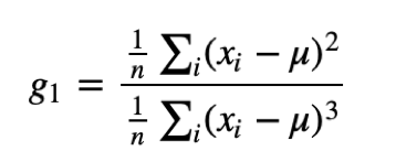
where μis the mean, σis the standard deviation, and nis the number of data points. The numerator is the mean squared deviation (or variance) and the denominator the mean cubed deviation.
Negative deviation indicates that the distribution “skews left” (it extends further to the left than to the right). One can easily see that the skewness for a normal distribution is zero, and any symmetric data must have a skewness of zero. Note that skewness can be affected by outliers! A simpler alternative is to look at the relationship between the mean μand the median μ1/2.
def skewness(x):
    res=0
    m=x.mean()
    s=x.std()
    for i in x:
        res+=(i-m)*(i-m)*(i-m)
    res/=(len(x)*s*s*s)
    return res

print ("The skewness of the male population is:", skewness(ml2_age))
print ("The skewness of the female population is:", skewness(fm2_age))
- Explain the result
The Pearson’s median skewness coefficient is a more robust alternative to the skewness coefficient and is defined as follows:
![]()
There are many other definitions for skewness that will not be discussed here. In our case, if we check the Pearson’s skewness coefficient for both men and women, we can see that the difference between them actually increases:
def pearson(x):
    return 3*(x.mean()-x.median())/x.std()

print ("The Pearson's coefficient of the male population is:", pearson(ml2_age))
print ("The Pearson's coefficient of the female population is:", pearson(fm2_age))
4.2.1.8 Relative Risk
Let’s say that a person is “early” promoted if he/she is promoted before the age of 41, “on time” if he/she is promoted of age 41, 42, 43 or 44, and “late” promoted if he/she is ascended to get income bigger than 50K after being 44 years old. Let us compute the probability of being early, on time and late promoted for men and women:
ml1 = df[(df.sex == 'Male')&(df.income=='>50K\n')]

ml2 = ml1.drop(ml1.index[(ml1['age']>df['age'].median() +35)&(ml1['age']> df['age'].median()- 15)])

fm2 = fm1.drop(fm1.index[(fm1['age']> df['age'].median() + 35)& (fm1['age']> df['age'].median() - 15)])

print (ml2.shape, fm2.shape)
print ("Men grouped in 3 categories:")
print ("Young:",int(round(100*len(ml2_age[ml2_age<41])/float(len(ml2_age.index)))),"%.")
print ("Elder:", int(round(100*len(ml2_age[ml2_age >44])/float(len(ml2_age.index)))),"%.")
print ("Average age:", int(round(100*len(ml2_age[(ml2_age>40) & (ml2_age< 45)])/float(len(ml2_age.index)))),"%.")
print ("Women grouped in 3 categories:")
print ("Young:",int(round(100*len(fm2_age[fm2_age <41])/float(len(fm2_age.index)))),"%.")
print ("Elder:", int(round(100*len(fm2_age[fm2_age >44])/float(len(fm2_age.index)))),"%.")
print ("Average age:", int(round(100*len(fm2_age[(fm2_age>40) & (fm2_age< 45)])/float(len(fm2_age.index)))),"%.")
The relative risk is the ratio of two probabilities. In order to get the relative risk of early promotion, we need to consider the fraction of both probabilities.
print ("The male mean:", ml2_age.mean())
print ("The female mean:", fm2_age.mean())
ml2_young = len(ml2_age[(ml2_age<41)])/float(len(ml2_age.index))
fm2_young  = len(fm2_age[(fm2_age<41)])/float(len(fm2_age.index))
print ("The relative risk of female early promotion is: ", 100*(1-ml2_young/fm2_young))
ml2_elder = len(ml2_age[(ml2_age>44)])/float(len(ml2_age.index))
fm2_elder  = len(fm2_age[(fm2_age>44)])/float(len(fm2_age.index))
print ("The relative risk of male late promotion is: ", 100*ml2_elder/fm2_elder)
Discussion
After exploring the data, we obtained some apparent effects that support our initial assumptions. For example, the mean age for men in our dataset is 39.4 years; while for women, is 36.8 years. When analyzing the high-income salaries, the mean age for men increased to 44.6 years; while for women, increased to 42.1 years. When the data were cleaned from outliers, we obtained mean age for high-income men: 44.3, and for women: 41.8. Moreover, histograms and other statistics show the skewness of the data and the fact that women used to be promoted a little bit earlier than men, in general.
4.2.5 Continuous Distribution
The distributions we have considered up to now are based on empirical observations and thus are called empirical distributions. As an alternative, we may be interested in considering distributions that are defined by a continuous function and are called continuous distributions.
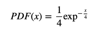
4.2.5.1 Exponential distribution
The CDF of the exponential distribution is:
CDF(x)=1−exp−λx
And its PDF is:
PDF(x)=λexp−λx
The parameter λ determines the shape of the distribution, the mean of the distribution is 1/λ and its variance is 1/λ2. The median is ln(2)/λ.
l = 3
x=np.arange(0,2.5,0.1)
y= 1- np.exp(-l*x)

plt.plot(x,y,'-')
plt.title('Exponential CDF: $\lambda$ =%.2f'% l ,fontsize=15)
plt.xlabel('x',fontsize=15)
plt.ylabel('CDF',fontsize=15)
plt.show()
from __future__ import division
import scipy.stats as stats

l = 3
x=np.arange(0,2.5,0.1)
y= l * np.exp(-l*x)

plt.plot(x,y,'-')
plt.title('Exponential PDF: $\lambda$ =%.2f'% l, fontsize=15)
plt.xlabel('x', fontsize=15)
plt.ylabel('PDF', fontsize=15)
plt.show()
There are a lot of real world events that can be described with this distribution.
- The time until a radioactive particle decays,
- The time it takes before your next telephone call,
- The time until default (on payment to company debt holders) in reduced form credit risk modeling.
The random variable X of the life lengths of some batteries is associated with a probability density function of the form:
l = 0.25

x=np.arange(0,25,0.1)
y= l * np.exp(-l*x)

plt.plot(x,y,'-')
plt.title('Exponential: $\lambda$ =%.2f' %l ,fontsize=15)
plt.xlabel('x',fontsize=15)
plt.ylabel('PDF',fontsize=15)
plt.show()
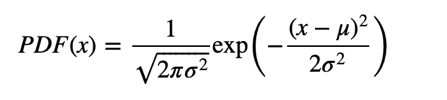
4.2.5.2 Normal distribution
The normal, or Gaussian distribution is the most used one because it describes a lot of phenomena and because it is amenable for analysis.
Its CDF has no closed-form expression and its more common representation is the PDF:
u=6 # mean
s=2 # standard deviation

x=np.arange(0,15,0.1)

y=(1/(np.sqrt(2*np.pi*s*s)))*np.exp(-(((x-u)**2)/(2*s*s)))

plt.plot(x,y,'-')
plt.title('Gaussian PDF: $\mu$=%.1f, $\sigma$=%.1f'%(u,s),fontsize=15)
plt.xlabel('x',fontsize=15)
plt.ylabel('Probability density',fontsize=15)
plt.show()
Examples:
- Measures of size of living tissue (length, height, skin area, weight);
- The length of inert appendages (hair, claws, nails, teeth) of biological specimens, in the direction of growth; presumably the thickness of tree bark also falls under this category;
- Certain physiological measurements, such as blood pressure of adult humans.
4.2.5.3 Central limit theorem
The normal distribution is also important, because it is involved in the Central Limit Theorem:
Take the mean of n random samples from ANY arbitrary distribution with a well-defined standard deviation σ and mean μ. As n gets bigger the distribution of the sample mean will always converge to a Gaussian (normal) distribution with mean μ and standard deviation σn√.
Colloquially speaking, the theorem states the distribution of an average tends to be normal, even when the distribution from which the average is computed is decidedly non-normal. This explains the ubiquity of the Gaussian distribution in science and statistics.
Example: Uniform Distribution
The uniform distribution is obviously non-normal. Let us call it the parent distribution.
To compute an average, two samples are drawn (n=2), at random, from the parent distribution and averaged. Then another sample of two is drawn and another value of the average computed. This process is repeated, over and over, and averages of two are computed.
Repeatedly taking more elements (n=3,4…) from the parent distribution, and computing the averages, produces a normal probability density.
fig, ax = plt.subplots(1, 4, sharey=True, squeeze=True, figsize=(14, 5))
x = np.linspace(0, 1, 100)
for i in range(4):
    f = np.mean(np.random.random((10000, i+1)), 1)
    m, s = np.mean(f), np.std(f, ddof=1)
    fn = (1/(s*np.sqrt(2*np.pi)))*np.exp(-(x-m)**2/(2*s**2))  # normal pdf
    ax[i].hist(f, 40, color=[0, 0.2, .8, .6])
    ax[i].set_title('n=%d' %(i+1))
    ax[i].plot(x, fn, color=[1, 0, 0, .6], linewidth=5)
plt.suptitle('Demonstration of the central limit theorem for a uniform distribution', y=1.05)
plt.show()
4.2.6 Kernel Density
In many real problems, we may not be interested in the parameters of a particular distribution of data, but just a continuous representation of the data. In this case, we should estimate the distribution non-parametrically (i.e., making no assumptions about the form of the underlying distribution) using kernel density estimation.
from scipy.stats.distributions import norm

# Some random data
y = np.random.random(15) * 10
x = np.linspace(0, 10, 100)

x1 = np.random.normal(-1, 2, 15) # parameters: (loc=0.0, scale=1.0, size=None)
x2 = np.random.normal(6, 3, 10)
y = np.r_[x1, x2] # r_ Translates slice objects to concatenation along the first axis.
x = np.linspace(min(y), max(y), 100)

# Smoothing parameter
s = 0.4

# Calculate the kernels
kernels = np.transpose([norm.pdf(x, yi, s) for yi in y])

plt.plot(x, kernels, 'k:')
plt.plot(x, kernels.sum(1), 'r')
plt.plot(y, np.zeros(len(y)), 'go', ms=10)
Let us imagine that we have a set of data measurements without knowing their distribution and we need to estimate the continuous representation of their distribution. In this case, we can consider a Gaussian kernel to generate the density around the data. Let us consider a set of random data generated by a bimodal normal distribution. If we consider a Gaussian kernel around the data, the sum of those kernels can give us a continuous function that when normalized would approximate the density of the distribution:
from scipy.stats import kde

x1 = np.random.normal(-1, 0.5, 15)

# parameters: (loc=0.0, scale=1.0, size=None)

x2 = np.random.normal(6, 1, 10)
y = np.r_[x1, x2]

# r_ Translates slice objects to concatenation along the first axis.

x = np.linspace(min(y), max(y), 100)
s = 0.4   # Smoothing parameter

kernels = np.transpose([norm.pdf(x, yi, s) for yi in y])

# Calculate the kernels
density = kde.gaussian_kde(y)

plt.plot(x, kernels, 'k:')
plt.plot(x, kernels.sum(1), 'r')
plt.plot(y, np.zeros(len(y)), 'bo', ms=10)
- What does the figure shows?
xgrid = np.linspace(x.min(), x.max(), 200)
plt.hist(y, bins=28)
plt.plot(xgrid, density(xgrid), 'r-')
SciPy implements a Gaussian KDE that automatically chooses an appropriate bandwidth. Let’s create a bi-modal distribution of data that is not easily summarized by a parametric distribution:
# Create a bi-modal distribution with a mixture of Normals.

x1 = np.random.normal(-1, 2, 15) # parameters: (loc=0.0, scale=1.0, size=None)
x2 = np.random.normal(6, 3, 10)

# Append by row
x = np.r_[x1, x2]

# r_ Translates slice objects to concatenation along the first axis.
plt.hist(x, bins=18)
In fact, the library SciPy3 implements a Gaussian kernel density estimation that automatically chooses the appropriate bandwidth parameter for the kernel. Thus, the final construction of the density estimate will be obtained by:
density = kde.gaussian_kde(x)
xgrid = np.linspace(x.min(), x.max(), 200)
plt.hist(x, bins=18)
plt.plot(xgrid, density(xgrid), 'r-')
4.2 Estimation
An important aspect when working with statistical data is being able to use estimates to approximate the values of unknown parameters of the dataset. In this section, we will review different kinds of estimators (estimated mean, variance, standard score, etc.).
x = np.random.normal(0.0, 1.0, 10000)
a = plt.hist(x,50)
Definition: Estimation is the process of inferring the parameters (e.g. mean) of a distribution from a statistic of samples drown from a population.
For example: What is the estimated mean μ̂ of the following normal data?
We can use our definition of empirical mean:
print ('The empirical mean of the sample is ', x.mean())
4.3.1 Sample and Estimated Mean, Variance and Standard Scores
In continuation, we will deal with point estimators that are single numerical estimates of parameters of a population.
4.3.1.1 Mean
Let us assume that we know that our data are coming from a normal distribution and the random samples drawn are as follows:
{0.33, −1.76, 2.34, 0.56, 0.89}.
The question is can we guess the mean μ of the distribution? One approximation is given by the sample mean, x ̄. This process is called estimation and the statistic (e.g., the sample mean) is called an estimator. In our case, the sample mean is 0.472, and it seems a logical choice to represent the mean of the distribution. It is not so evident if we add a sample with a value of −465. In this case, the sample mean will be −77.11, which does not look like the mean of the distribution. The reason is due to the fact that the last value seems to be an outlier compared to the rest of the sample. In order to avoid this effect, we can try first to remove outliers and then to estimate the mean; or we can use the sample median as an estimator of the mean of the distribution. If there are no outliers, the sample mean x ̄ minimizes the following mean squared error:
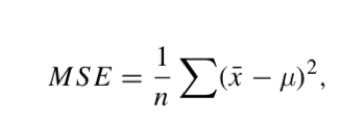
where n is the number of times we estimate the mean. Let us compute the MSE of a set of random data:
NTs=200
mu=0.0
var=1.0
err = 0.0
NPs=1000
for i in range(NTs):
    x = np.random.normal(mu, var, NPs)
    err += (x.mean()-mu)**2

print ('MSE: ', err/NTs)
- What do you obtained as result?
4.3.1.2 Variance
We can also estimate the variance with:
σ̂ 2=1n∑i(xi−μ)2
This estimator works for large samples, but it is biased for small samples. We can use this one:
σ̂ 2n−1=1n−1∑i(xi−μ)2
4.3.1.3 Standard scores
zi=xi−μ/σ
This measure is dimensionless and its distribution has mean 0 and variance 1.
It inherits the “shape” of X: if it is normally distributed, so is Z. If X is skewed, so is Z.
4.3.1.4 Covariance
Covariance is a measure of the tendency of two variables to vary together.
If we have two series X and Y with X={xi} and Y={yi}, and they vary together, their deviations xi−μX and yi−μY tend to have the same sign.
If we multiply them together, the product is positive, when the deviations have the same sign, and negative, when they have the opposite sign. So, adding up the products gives a measure of the tendency to vary together.
Covariance is the mean of the products:
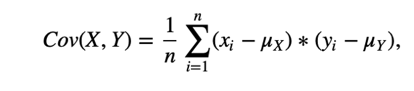
where n is the length of the two series.
It is a measure that is difficult to interpret.
def Cov(X, Y):
    def _get_dvis(V):
        return [v - np.mean(V) for v in V]
    dxis = _get_dvis(X)
    dyis = _get_dvis(Y)
    return np.sum([x * y for x, y in zip(dxis, dyis)])/len(X)


X = [5, -1, 3.3, 2.7, 12.2]
X= np.array(X)
Y = [10, 12, 8, 9, 11]

print ("Cov(X, X) = %.2f" % Cov(X, X))
print ("Var(X) = %.2f" % np.var(X))

print ("Cov(X, Y) = %.2f" % Cov(X, Y))
Let us create some examples of positive and negative correlations like those showing the relations of stock market with respect to the economic growth or the gasoline prices with respect to the world oil production:
MAXN=100
MAXN=40

X=np.array([[1,9],[3, 2], [5,3],[5.5,4],[6,4],[6.5,4],[7,3.5],[7.5,3.8],[8,4],
[8.5,4],[9,4.5],[9.5,7],[10,9],[10.5,11],[11,11.5],[11.5,12],[12,12],[12.5,12],[13,10]])
plt.subplot(1,2,1)
plt.scatter(X[:,0],X[:,1],color='b',s=120, linewidths=2,zorder=10)
plt.xlabel('Economic growth(T)',fontsize=15)
plt.ylabel('Stock market returns(T)',fontsize=15)
plt.gcf().set_size_inches((20,6))
X=np.array([[1,8],[2, 7], [3,6],[4,8],[5,8],[6,7],[7,7],[8,5],[9,5],[10,6],[11,4],[12,5],[13,3],[14,2],[15,2],[16,1]])

plt.subplot(1,2,1)
plt.scatter(X[:,0],X[:,1],color='b',s=120, linewidths=2,zorder=10)
plt.xlabel('World Oil Production(T)',fontsize=15)
plt.ylabel('Gasoline prices(T)',fontsize=15)
plt.gcf().set_size_inches((20,6))
4.3.1.5 Pearson’s correlation
Shall we consider the variance? An alternative is to divide the deviations by σ, which yields standard scores, and compute the product of standard scores:
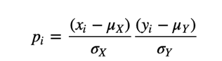
The mean of these products is:
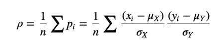
Or we can rewrite ρ by factoring out σX and σY:
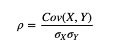
def Corr(X, Y):
    assert len(X) == len(Y)
    return Cov(X, Y) / np.prod([np.std(V) for V in [X, Y]])

print ("Corr(X, X) = %.5f" % Corr(X, X))

Y=np.random.random(len(X))

print ("Corr(X, Y) = %.5f" % Corr(X, Y))
When ρ=0, we cannot say that there is no relationship between the variables!
Pearson’s coefficient only measures linear correlations!
4.3.2.6 Spearsman’s rank correlation
Pearson’s correlation works well if the relationship between variables is linear and if the variables are roughly normal. But it is not robust in the presence of outliers.
Spearman’s rank correlation is an alternative that mitigates the effect of outliers and skewed distributions. To compute Spearman’s correlation, we have to compute the rank of each value, which is its index in the sorted sample.
For example, in the sample {7, 1, 2, 5} the rank of the value 5 is 3, because it appears third if we sort the elements.
Then, we compute the Pearson’s correlation, but for the ranks.
def list2rank(l):
    #l is a list of numbers
    # returns a list of 1-based index; mean when multiple instances
    return [np.mean([i+1 for i, sorted_el in enumerate(sorted(l)) if sorted_el == el]) for el in l]

l = [7, 1, 2, 5]
print ("ranks: ", list2rank(l))

def spearmanRank(X, Y):
    # X and Y are same-length lists
    print (list2rank(X) )
    print (list2rank(Y))
    return Corr(list2rank(X), list2rank(Y))

X = [10, 20, 30, 40, 1000]
Y = [-70, -1000, -50, -10, -20]
plt.plot(X,'ro')
plt.plot(Y,'go')

print ("Pearson rank coefficient: %.2f" % Corr(X, Y))
print ("Spearman rank coefficient: %.2f" % spearmanRank(X, Y))
Exercise: Obtain for the Anscombe's quartet [2] given in the figures bellow, the different estimators (mean, variance, covariance for each pair, Pearson's correlation and Spearman's rank correlation.
X=np.array([[10.0, 8.04,10.0, 9.14, 10.0, 7.46, 8.0, 6.58],
[8.0,6.95, 8.0, 8.14, 8.0, 6.77, 8.0, 5.76],
[13.0,7.58,13.0,8.74,13.0,12.74,8.0,7.71],
[9.0,8.81,9.0,8.77,9.0,7.11,8.0,8.84],
[11.0,8.33,11.0,9.26,11.0,7.81,8.0,8.47],
[14.0,9.96,14.0,8.10,14.0,8.84,8.0,7.04],
[6.0,7.24,6.0,6.13,6.0,6.08,8.0,5.25],
[4.0,4.26,4.0,3.10,4.0,5.39,19.0,12.50],
[12.0,10.84,12.0,9.13,12.0,8.15,8.0,5.56],
[7.0,4.82,7.0,7.26,7.0,6.42,8.0,7.91],
[5.0,5.68,5.0,4.74,5.0,5.73,8.0,6.89]])
plt.subplot(2,2,1)
plt.scatter(X[:,0],X[:,1],color='r',s=120, linewidths=2,zorder=10)
plt.xlabel('x1',fontsize=15)
plt.ylabel('y1',fontsize=15)
plt.subplot(2,2,2)
plt.scatter(X[:,2],X[:,3],color='r',s=120, linewidths=2,zorder=10)
plt.xlabel('x1',fontsize=15)
plt.ylabel('y1',fontsize=15)
plt.subplot(2,2,3)
plt.scatter(X[:,4],X[:,5],color='r',s=120, linewidths=2,zorder=10)
plt.xlabel('x1',fontsize=15)
plt.ylabel('y1',fontsize=15)
plt.subplot(2,2,4)
plt.scatter(X[:,6],X[:,7],color='r',s=120, linewidths=2,zorder=10)
plt.xlabel('x1',fontsize=15)
plt.ylabel('y1',fontsize=15)
plt.gcf().set_size_inches((10,10))
Main references
[1] Think Stats: Probability and Statistics for Programmers, by Allen B. Downey, published by O’Reilly Media. http://www.greenteapress.com/thinkstats/
[2] Anscombe’s quartet, https://en.wikipedia.org/wiki/Anscombe%27s_quartet